Are we tired of beige, or of rooms that could be anywhere
Colour is coming back to hotel interiors, and the trade press has decided this is a design story. It is closer to a complaint, made by guests, about rooms that could be anywhere.

There is a particular room that has run the last ten years. Pale oak, warm white walls, a bouclé chair angled towards a window. Linen the colour of oatmeal. A brass reading light on a swing arm, a rug in undyed wool, one ceramic object on a shelf chosen specifically for its lack of opinion. It is a pleasant room. It is often a very well made room. It photographs so beautifully that entire booking decisions have been made on the strength of a single image of its corner.
Three weeks later you cannot describe it. Not vaguely: at all. You can tell someone the bed was comfortable and the shower was good, which is what you would say about a room you had never seen.
What the trade press is calling it
The industry has noticed, and has given the noticing a vocabulary. Maximalism. Colour drenching. Deep botanicals. Crafted abundance. The framing in the design magazines is that after a decade of restraint, designers grew bored and wanted to play again, which is a flattering story for designers and gives the supply side rather too much credit.
Guests got there first. Colour is returning because people stopped being moved by rooms that asked nothing of them, and the bookings and the photographs and the word of mouth followed the rooms that did. The palette evidence is not subtle. Cold greys have faded. Stark white-on-white has faded harder. What has replaced them is warm neutral, earthy warm, deep botanical and, in the more confident properties, a genuinely dark ground. Colour did not disappear in 2014 because the industry disliked it. It has come back because its absence stopped reading as sophisticated and started reading as unfinished.
The thing that actually went missing
Boredom is the easy answer and the wrong one. Plenty of restful things are boring and we pay for them happily. What went missing was recognition.
A minimalist room in Málaga is the same room as a minimalist room in Malmö. That is not a failure of the style. That is the entire point of the style, and it is why it spread as fast as it did. Pale neutral interiors are portable by design. The specification fits in a document. It can be issued to a contractor in a city the operator has no relationship with, executed by people who have never been there, and it will land within tolerance every time. It was a gift to anyone opening forty properties in eleven countries in six years.
So they took it everywhere, and the result is a category of hotel that could be anywhere, staffed, very often, by people who could tell you a great deal about the city if the room had left any room for it. The front desk knows which bakery opens at seven. The bedroom has been carefully arranged to make sure you never wonder.
Colour and pattern travel badly. That is precisely their argument. A tiled stair is from somewhere. A green bar has a reason, usually a bad one involving a previous owner, and the reason is worth hearing. Painted joinery in a Sevillian townhouse is performing a function no bouclé chair can perform, which is telling you where you woke up.
Painted joinery in a Sevillian townhouse is performing a function no bouclé chair can perform, which is telling you where you woke up.
What people photograph
The fatigue shows up in behaviour long before it shows up in a trade report, which lags by roughly two years and is written by people reading the same three sources.
Watch what guests actually photograph. Lobbies, overwhelmingly. Stairs, bars, courtyards, the corner of a dining room at the hour the light does something. Almost nobody photographs the bedroom, which is the part they paid for. The properties people name without being asked are the ones with a colour attached: the red dining room, the green bar, the blue tile in the courtyard, the corridor carpet that should not work. Nobody names a white room. There is no white room in anybody's list of hotels they loved, because there is nothing in it to hang the memory on.
Ask someone about a hotel they liked and they will not give you a specification. They will describe an object, a texture, or the light at a particular hour on a particular surface. That is a memory, and it needs somewhere to attach. A room that offers no purchase gets none.
The past as a new portable specification
Some of this is nostalgia, plainly, and there is no shame in it. A great deal of the strongest current work is in revived heritage buildings: rooms that already existed and have been brought back rather than invented, with mid-century and deco references sitting comfortably in them because the bones were already there. The appetite is for interiors with a past, on the reasonable assumption that a room with a past implies a place with one.
The risk is obvious once you say it out loud. Period reference can become its own portable specification. A deco lobby is as droppable into any city as a beige one, and it arrives with the same problem in better shoes. Sourcing a look from 1932 is not the same as sourcing it from the street outside. The first is a mood board. The second requires knowing who in the city still makes tile, and paying them.
In defence of the plain bedroom
Minimalism deserves better than the kicking it is currently getting. Restraint is genuinely restful. A plain bedroom is the correct decision in a hotel whose actual purpose is sleep, and there are many such hotels, doing honest work near airports and stations and in cities people visit for one night and a meeting. Nobody needs a botanical mural at half past five in the morning.
What failed was not the idea but the copy of it. Neutral as a default rather than a decision, adopted by operators who wanted a scheme structurally incapable of offending anybody. Bad minimalism and bad maximalism fail in exactly the same way, and the failure has nothing to do with the palette. Neither one tells you where you are.
Whether it gets past the lift
Some scepticism about the correction is warranted, because a good deal of what is being sold as the return of colour is a lobby refit and nothing beyond it. The ground floor goes deep green and gets a photographer. The bedrooms upstairs stay exactly as they were: oatmeal, oak, one uncontroversial ceramic.
That tells you how the industry has read the fatigue. As a photography problem rather than a living one. Colour where guests take pictures, calm where they sleep, and a press release describing the whole thing as a bold reimagining. If people are genuinely tired of beige, and the behaviour suggests they are, the test is whether the colour makes it past the lift. Mostly it has not, yet.
So the tiredness is real and deserved, but the answer is not more pattern, and it is certainly not more pattern in the one room the camera sees. The answer is rooms that could only exist in the city they stand in. Colour makes that possible. It does not guarantee it. A considerable amount of money is about to be spent on being loud in a way that will still leave you unable to say, at breakfast, where you are.
Read next

The paradores of Andalucia, and how to pick the ones worth the detour
Spain runs ninety-odd hotels in castles, monasteries and Renaissance palaces, at an average of about £112 a night. Five in Andalucia worth going out of your way for, including a UNESCO palace at €104 and a convent inside the Alhambra walls.
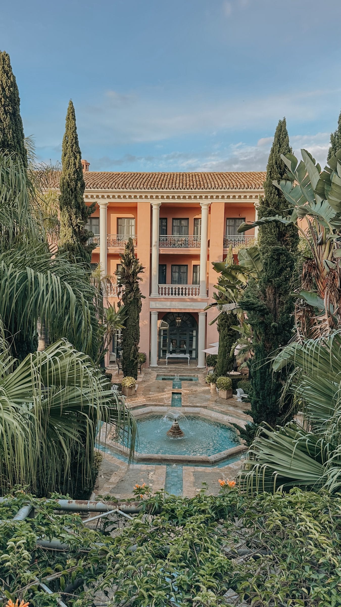
Anantara Villa Padierna: a Tuscan palace above Marbella, and the finest gardens on this coast
An Italianate palace ten minutes inland from Marbella, with formal gardens worth the trip on their own, a Roman pool, and staff who are the reason you would go back.

Against the itinerary, or why the best days away were the ones you did not plan
A weekend at home has to be planned, or the week will plan it for you. Away is the opposite. Everything you were trying to build arrives on its own, and the surest way to lose it is to fill the days up.